19/01/2011

Business Module

This is the work I did for the first Business Module hand in - it was a business card, CV and a cover letter. Through different design stages I came up with the following business card design and then translated it into Japanese and Chinese as I hope to work in Asia a lot. So, here are the business card layouts:


This is a simplified rendered version of what the pop-up itself might look like:


This is the design for my CV - when you pull the tab on the side, the green flaps slide in and under to reveal the written information:


This is the design for the cover letter, which I'm really happy with!! I had to pick a job to 'apply' to, so I picked one in the BBC:


Sian's Schedule ^_^

This is just a small thing I did to give Sian a hand this morning - she went through her film and figured out the length and the complexity of the animation for each shot, and then grouped them into 'minimal animation', 'complex animation' and 'hold shots'. I then took the blank schedule for the year and organised it into AM and PM sectioned days to help her see her progress and keep on track. Of course, things are subject to change but essentially this with just help her see how much time she has and how much work left. I enjoyed doing it and it only took a very short amount of time, so if anyone else wants a schedule... ^_^


11/01/2011

Budgets YAY!

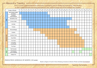
My favourite part of the project is the production pack side of it. I enjoyed researching different budgeting techniques and programs, and looked at Showbiz Scheduling's Disney Master. Below are my Production Breakdowns, my Schedule for Production, a mock Film Schedule and my Budget Summary and Detail. Most of the figures are based on real finance, though some of it I had to make an educated guess, so it's not entirely accurate. But I really enjoyed it and am happy with what I produced.


Props and Things

These are some different designs for the logos, props and vehicles that are used throughout the film, though a lot of them I am still not sure on. Saoirse is irish for Freedom, so I think that work well. I'm still having a lot of difficulty drawing as it's not something I enjoy anymore, but I'm happy with some of the designs I've come up with.


Characters

These are my current character designs. I quite like how they are going but there's still a long way to go. But I am glad I have a clear direction now with style and costume.


Media Stuff

I don't work well with different media, so I thought I'd try to use as many as I could find. I liked using the black pens and ink, and also found a good technique with pastels. The cutout clothes is something I'd like to use more in development.


Initial Character Design - Monarch

The Monarch is a little hard as I'm not used to drawing older characters. But her costume will be the most elaborate, so I can enjoy drawing different designs for that. I need to make sure she looks powerful but still older than the others without being frail. I also want to design a creature as a sidekick for her, so I'm thinking of basing it on my lizards! They do interesting things so there are features I can take to make good designs.


Initial Character Design - Niamh

I want a flowing, beautiful, curved design for Niamh as it should match her ethereal nature. I also want her to contrast the human characters a lot in her femininity and have different eyes and skin. I think it's best for her to be unclothed as, because she's a spirit, it'd be unnatural for her to wear clothes.


Initial Character Design - Lucian

Lucian is a little easier as I find a lot of inspiration for the character in my friend Luke (the similar name was not intentional!) I need to remember to incorporate steampunk themes into my designs, as sometimes I make the costumes too normal. I want to go with relatively normal proportions as it suits my film better.